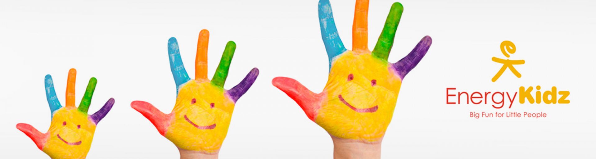
Big fun for little people
The Brief
Energy Kidz asked Gasp to create a unique and visually interesting new logo and brand toolkit. Crucially, the branding needed to appeal to Energy Kidz’s three most important groups: schools, parents and, of course, the children.
Energy Kidz is a leading provider of out of school childcare for primary school aged children.
The Response
We wanted to retain some of the brand’s equity, so we organised a series of meetings with key stakeholders, and also a survey of existing customers, to find out the wider perception of the brand’s strengths and weaknesses, as well as how Energy Kidz see themselves.
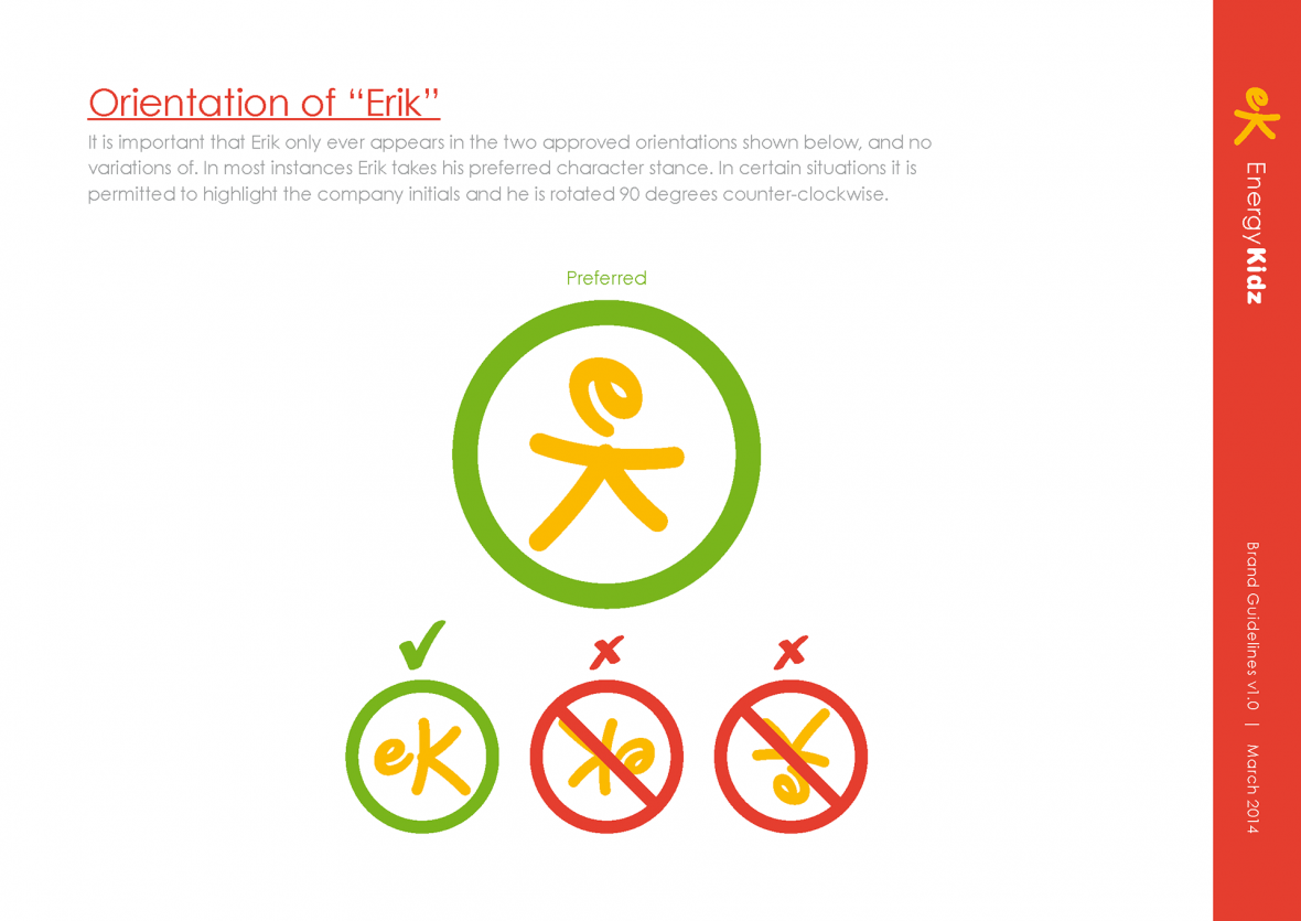
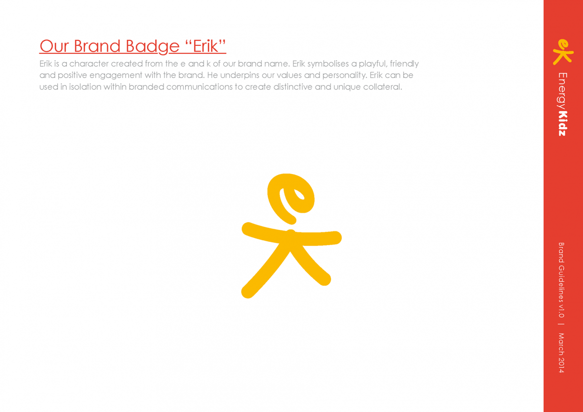
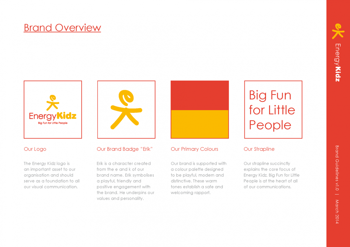
This information helped to guide the creative process. Starting from a simple base can often bring great results. By taking the initials of the company name, we created Erik as the brand badge. Its success lies in its ability to both symbolise a playful, friendly and positive engagement with the brand (a cheery stickman whom any of the children could have doodled), whilst also encapsulating Energy Kidz’s important, professional values.
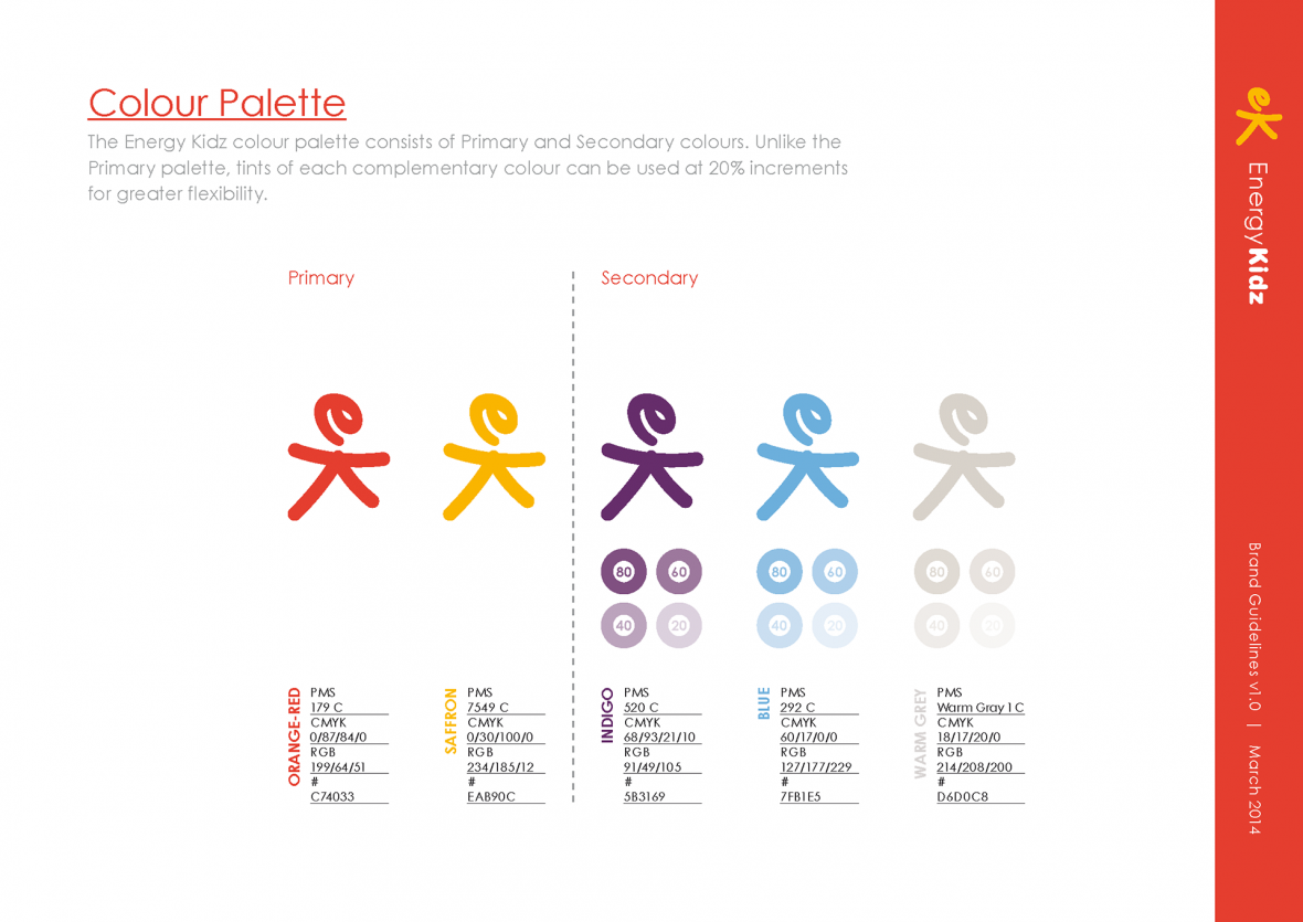
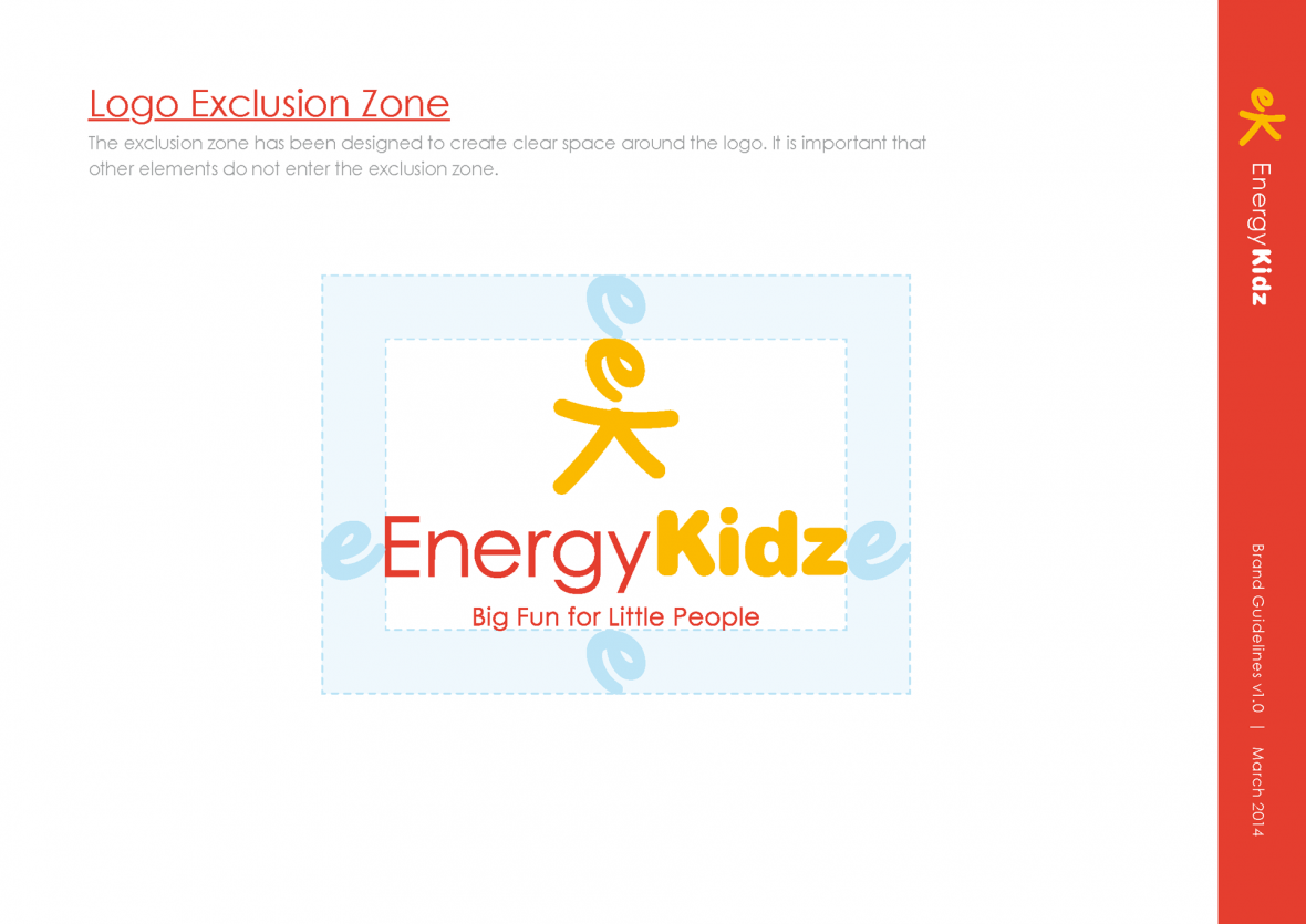
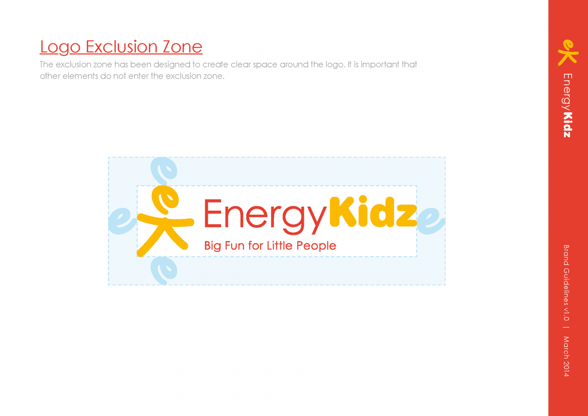
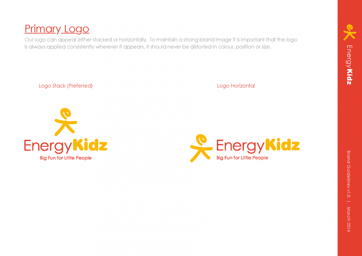
The spacious, modern Century Gothic was our headline typeface, and the colour palette’s primary colours are distinctive and warm shades of orange and yellow, kept from the original brand, but improved and cleaned up. All of this combines to establish a safe, welcoming rapport, whilst the strapline ‘Big Fun for Little People’ succinctly explains the core values of Energy Kidz.
By taking the initials of the company name, we created Erik as the brand badge. Its success lies in its ability to both symbolize a playful, friendly and positive engagement with the brand (a cheery stickman whom any of the children could have doodled), whilst also encapsulating Energy Kidz’s important, professional values.

The Results
The striking images in and around these words will bear testament to the final result! Not everyone notices the E and K in the logo on first viewing. They could be called unobservant, but we’re proud that there’s some subtlety in the piece, and some of the great logos of the world have hidden depth.
Above all we had a very happy client by the end of this project, as can be seen in their testimonial.
Crucially, the branding needed to appeal to Energy Kidz’s three most important groups: schools, parents and, of course, the children.

Melanie Dalziel, Head of Marketing, Energy Kidz
“We have been delighted with the branding work Gasp has recently completed for us. They were always available to discuss each stage of the process and listen and adapt each stage to meet our needs.”