Refresh School Brand Collateral
The Brief
The Marist Schools were keen to introduce a feminine touch to their existing brand communications, alongside increasing awareness in the Berkshire area.
The Response
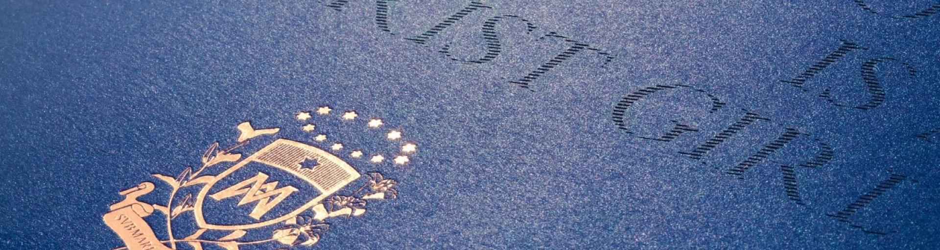
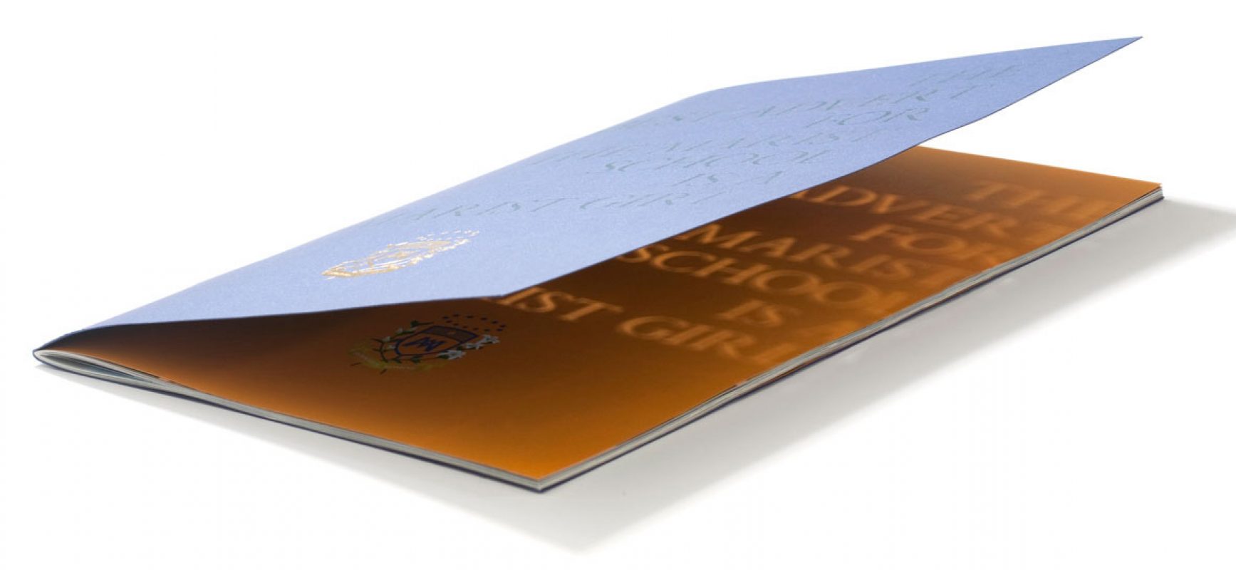
Our process began with their School Prospectus. To the School’s Crest we added delicate buds and blooms to inject life and depict the growth and development of pupils; something which underpins every moment of school life.
For the cover we sourced Curious Touch steel blue, bringing a dazzling shimmer to the corporate blue of their palette. Combining this with delicate and intricate typography, the laser cutting of their strapline and a splash of foil to the new crest, we created a School Prospectus that is elegant, unique, desirable and feminine.
We also designed and created print-ready artwork for adverts, all centred around the Schools’ ethos that ‘The best advert for the Marist is a Marist girl’.
Individual Twitter profiles for the Schools’ different departments took the key components from the newly designed crest to create a unique emblem for each department.
Combining this with delicate and intricate typography, the laser cutting of their strapline and a splash of foil to the new crest, we created a School Prospectus that is elegant, unique, desirable and feminine.
The Results
We have had a long association now with the Marist, creating a lot of success for them. The Marist Schools had a long, prestigious history before they came to Gasp for creative solutions, but there is no doubt that their branding now has a more modern, fresh and feminine feel that will set them in good stead for attracting pupils of the highest calibre; pupils who will form integral parts of our society’s future.