
WHAT’S IN A NAME? EVERYTHING.
The Brief
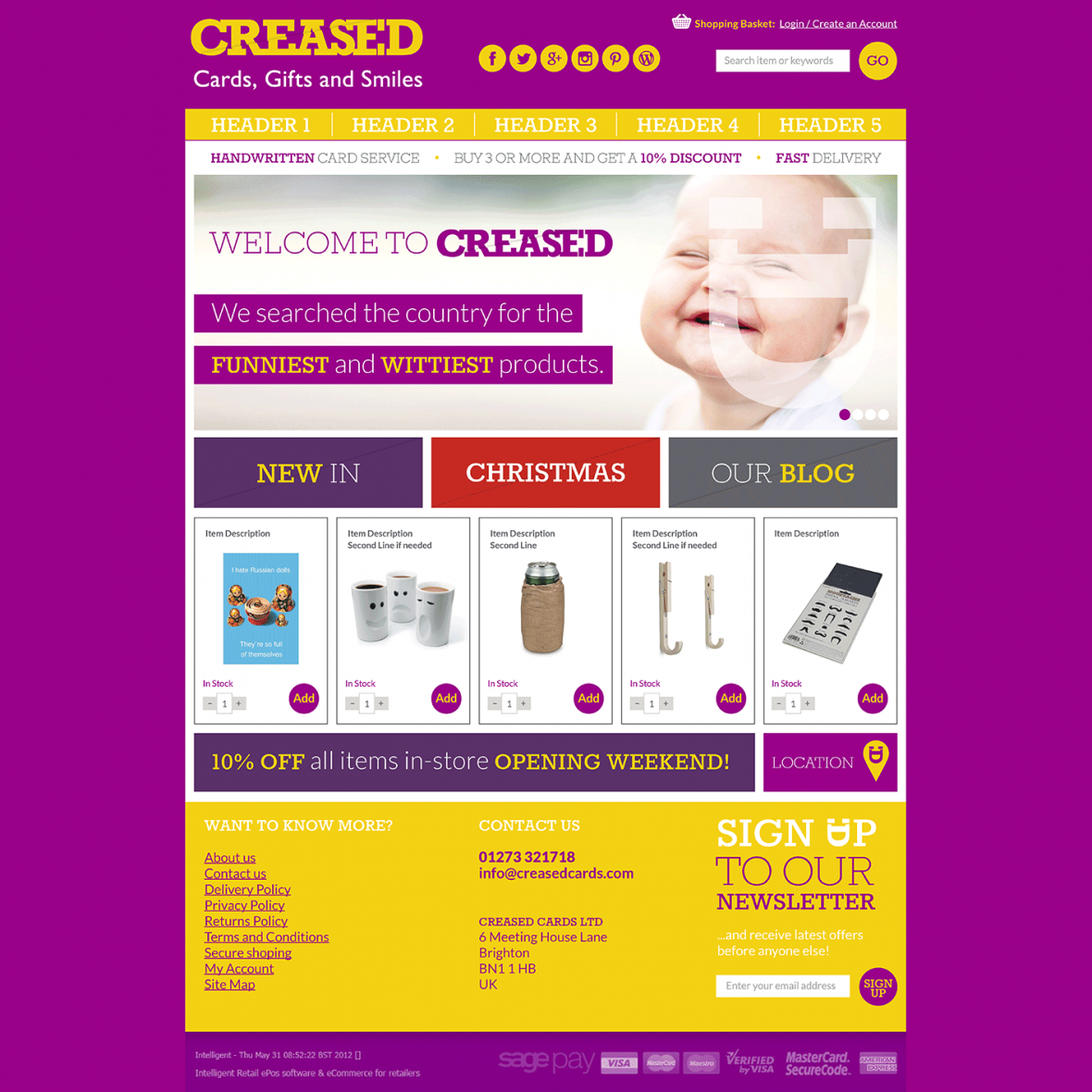
Most greeting cards ventures make their home solely in the digital space, but Creased’s owner Paul Jarman wanted bricks and mortar too. He wanted to watch people leave their premises with a smile on their face and with a fantastic product in their hands. Their personality-driven, ambitious philosophy had to be embodied in the branding, which needed to compete against big high street players instore and online.
The Response
Paul was already set on the name ‘Creased’ which we loved as it worked on so many levels. Our job was to develop the word into a visual and verbal identity like nothing else.
Whatever the occasion, from birthdays to weddings, or messages wishing ‘Get Well Soon’, the gesture is in many ways like sharing a smile.
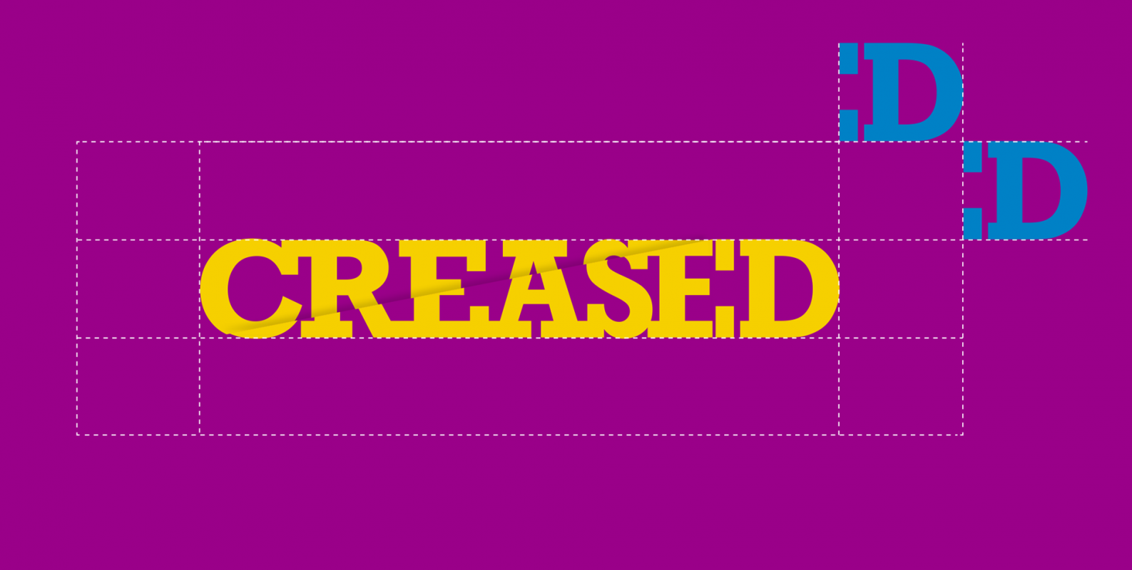
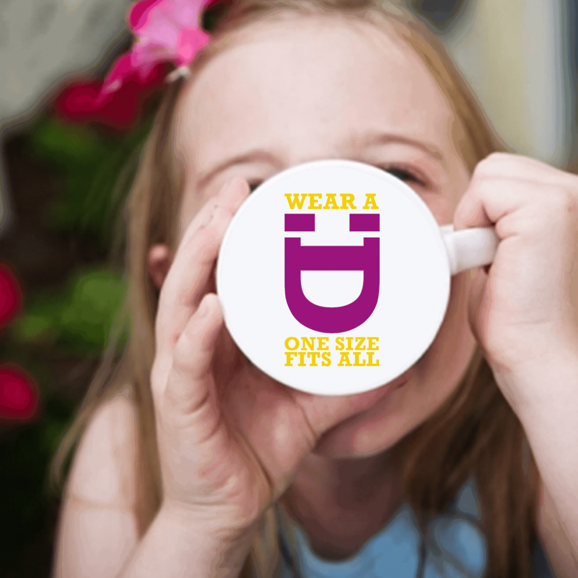
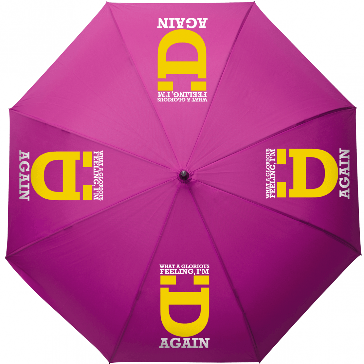
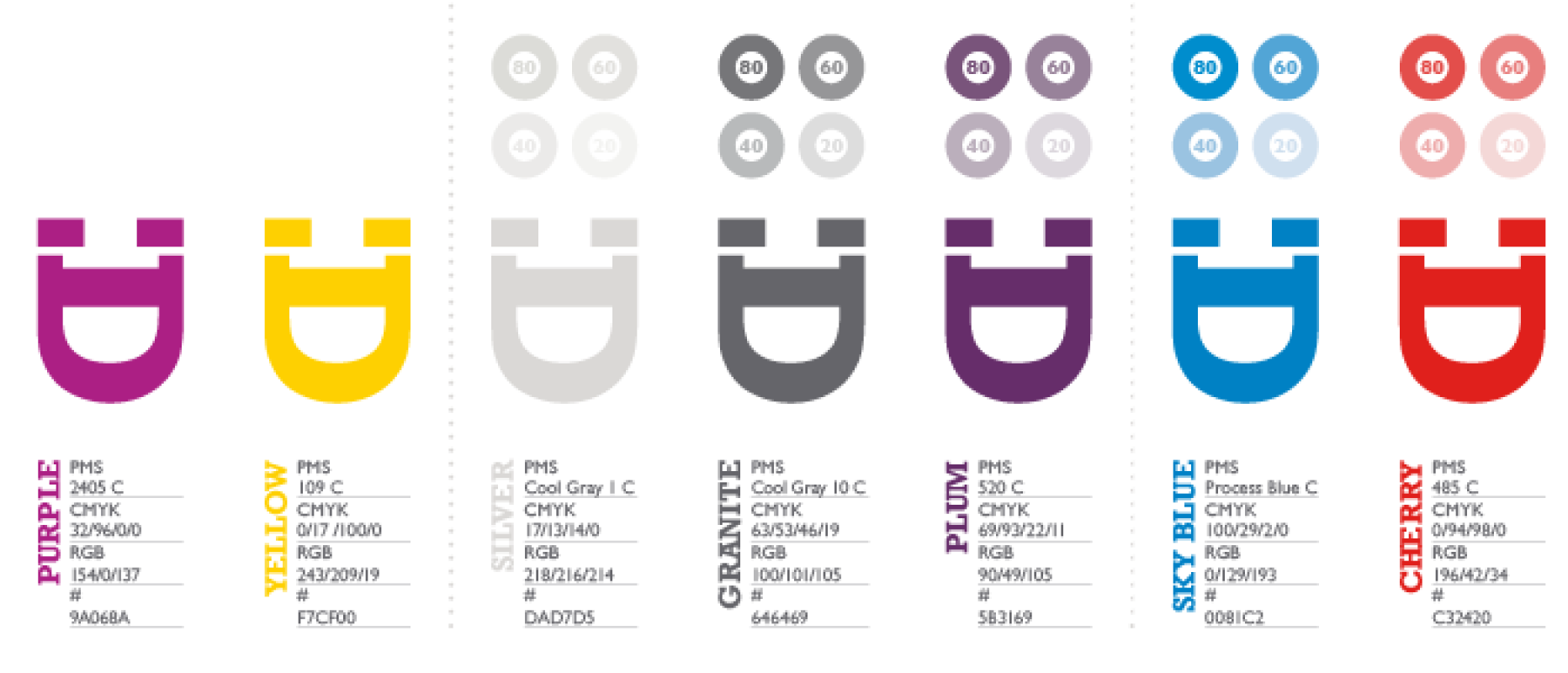
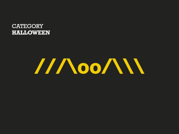
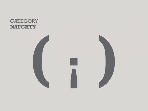
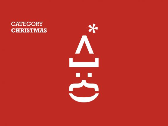
The Creased logo devise was naturally born out of the logo, formed from the ‘ED’ of ‘creased’ into a strong smiling motif suggesting happiness, laughter and associated positive emotions.
The visually striking primary colour palette of purple and yellow was complimented by a seasonal palette allowing Paul to create distinct campaigns to reflect peak selling times such as Christmas.
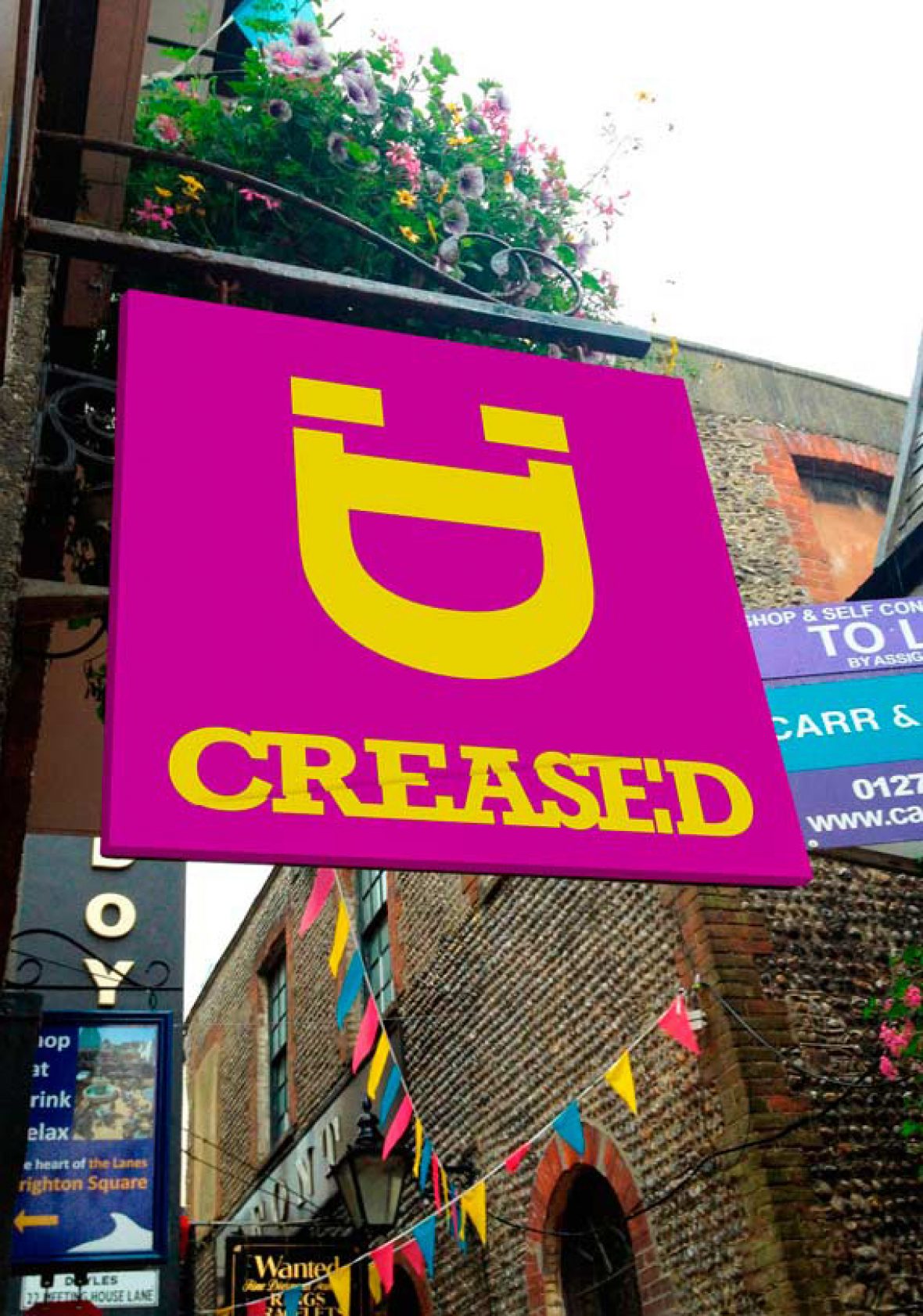
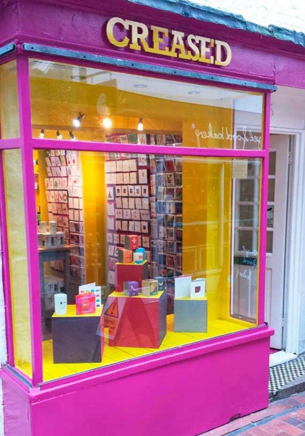
An award winning, innovative and exciting greeting card and gift retailer in the world famous Lanes in Brighton.
The Results
The resulting brand created real stand out both instore and online. Such was the popularity of the shop that Paul moved to new larger premises four years later to keep up with demand. He was also recognised in industry awards, picking up “Best Independent Greeting Card Retailer – Home Counties” just three years after opening.

Paul Jarman, Owner, Creased Cards
“The consultative process worked really well, their ideas were strong and we ended up with a super brand identity that I knew my customers would love. On top of the brand work, they devised and ran our launch activity; we were busy from the start and we’ve never looked back. I would recommend Gasp to any business.”